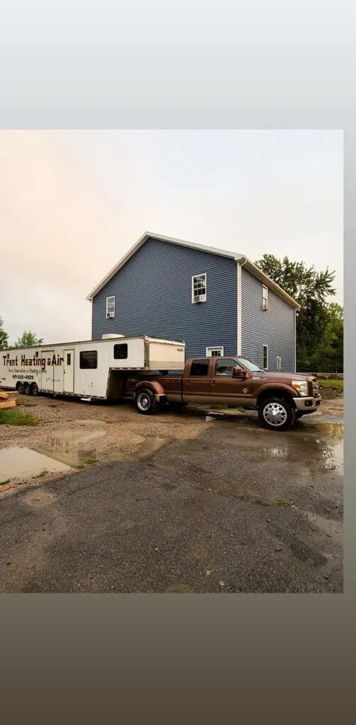
Today on Barndominium Life, we are featuring this tasteful and wonderfully refined Ohio shouse built by Travis Trent in Port Clinton. Though the design is simple, there are many surprises throughout the entire thing and we can’t wait to show you what is in store. This kind of home is exactly what we love to showcase here and we think it has been done to absolute perfection. With so much going on in such a small package, it’s a great way to show just what can be done with one of these homes.
Page Contents
Exterior
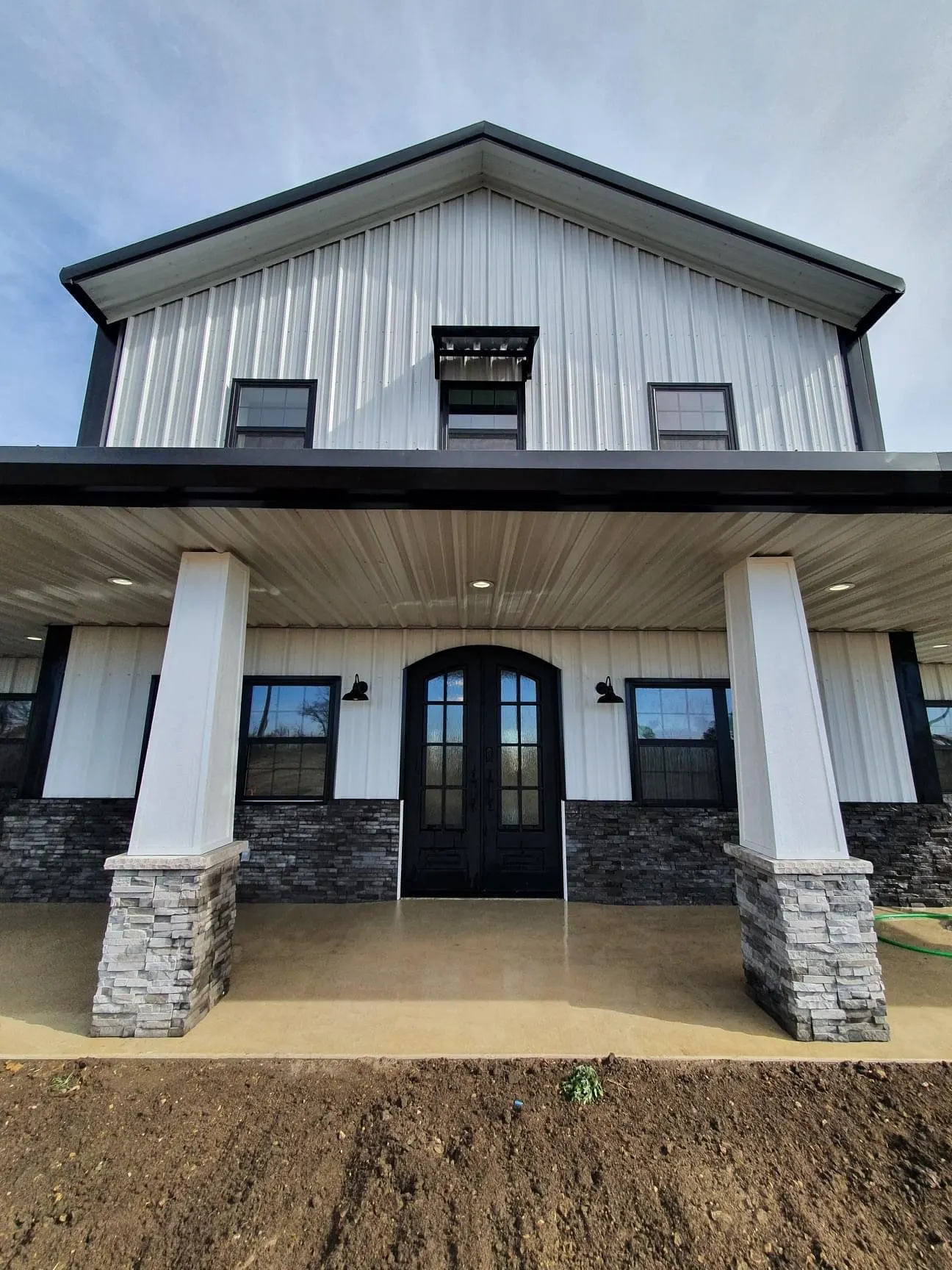
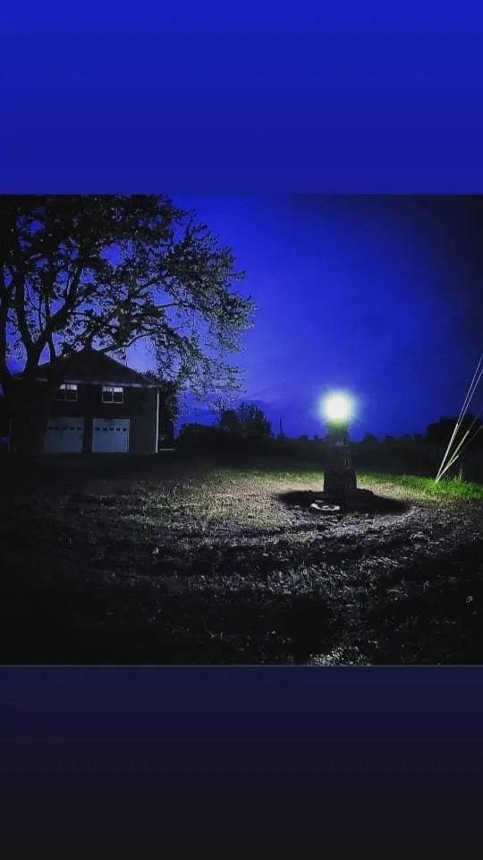
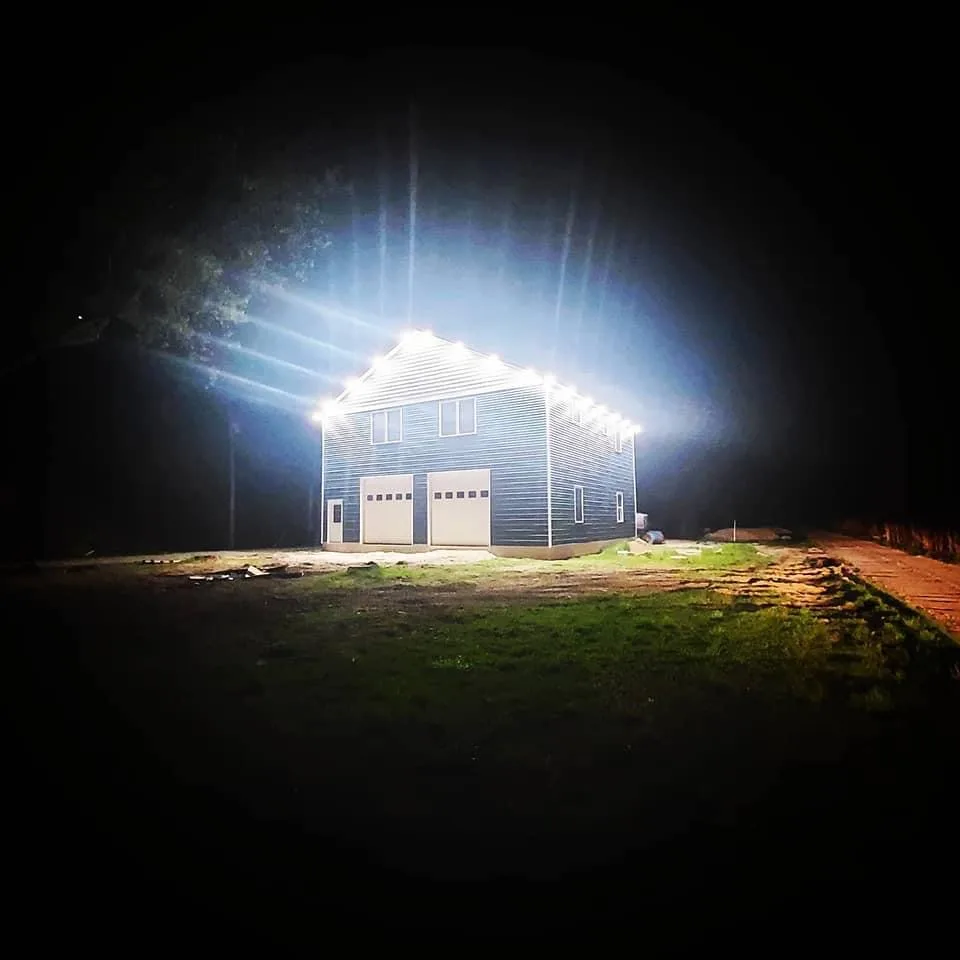
One of the first things you will notice about this Ohio shouse is the lighting out front. This is one of the major benefits of being able to build your own home: you can give it the exact kind of vibe you want for your style and aesthetics. Nowhere is this more apparent than in the exterior lighting of this home. We love the lighthouse fixture out front and think it is a great addition to this shouse.
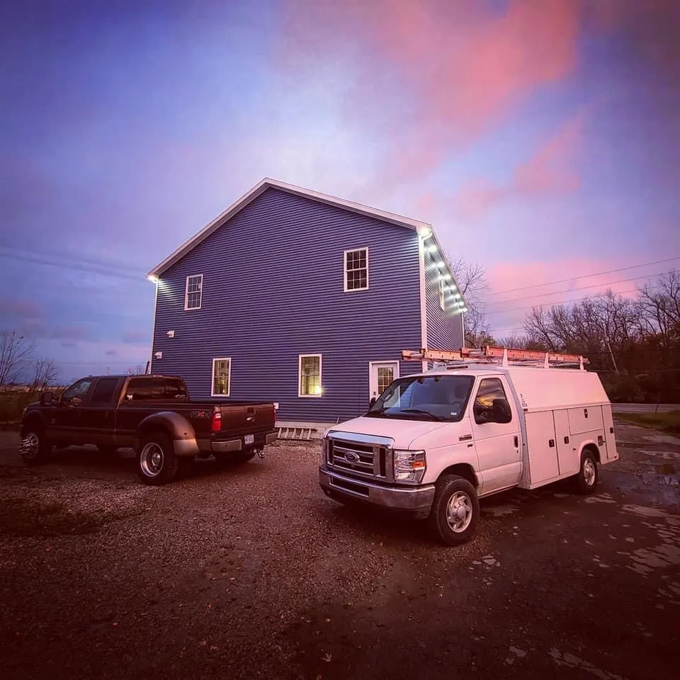
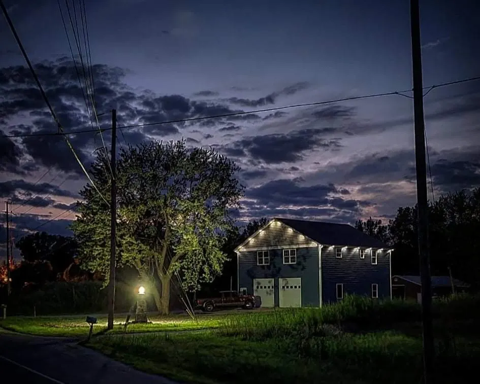
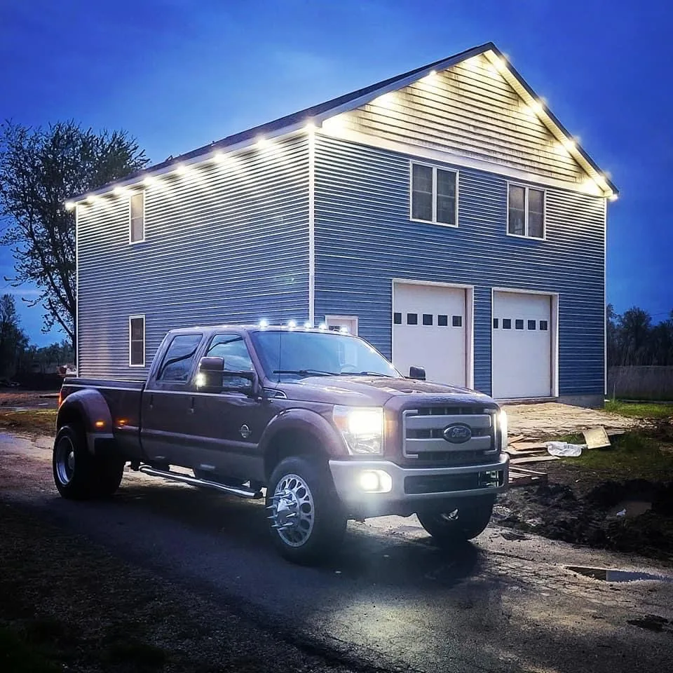
One of the things this Ohio shouse has more than enough of is storage space. We love the two front garage doors that lead into the car parking area. They give the back end of the home a great, classic look that is perfect for fitting almost anything into and having enough space for an actual living area. That is one of the keys to this type of home. Being able to live in it comfortably while still using it for the structure’s original intended purpose.
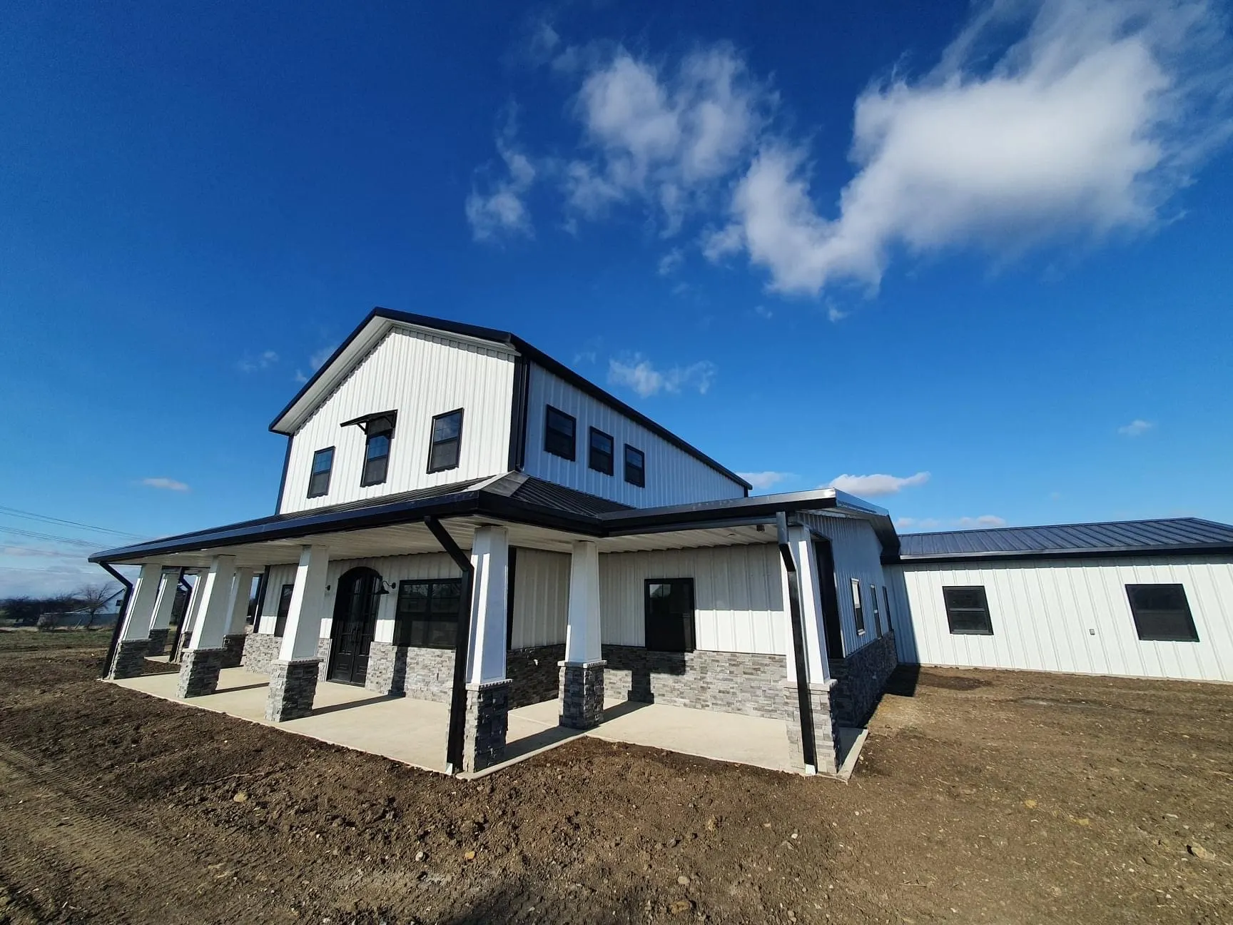
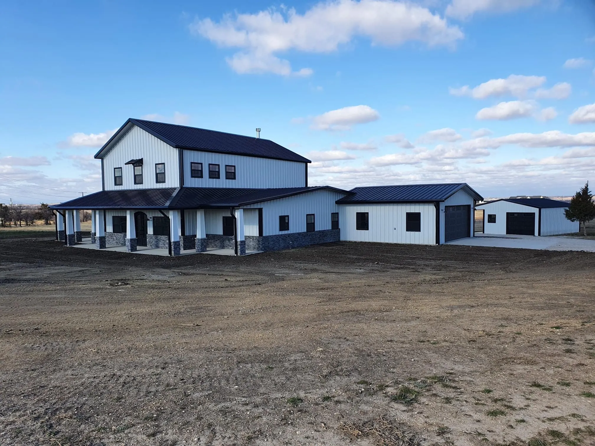
In the snow, the simple design of this Ohio shouse really shines. It is such a classic, elegant design that looks great against this kind of landscape. This is also where the lighthouse structure upfront offers a wonderful, welcoming addition to the front facade of the home. Having little touches like this in front of your home can be a great way to show how inviting your home is, which is even more important when the weather gets cold.
Interior
Living Area
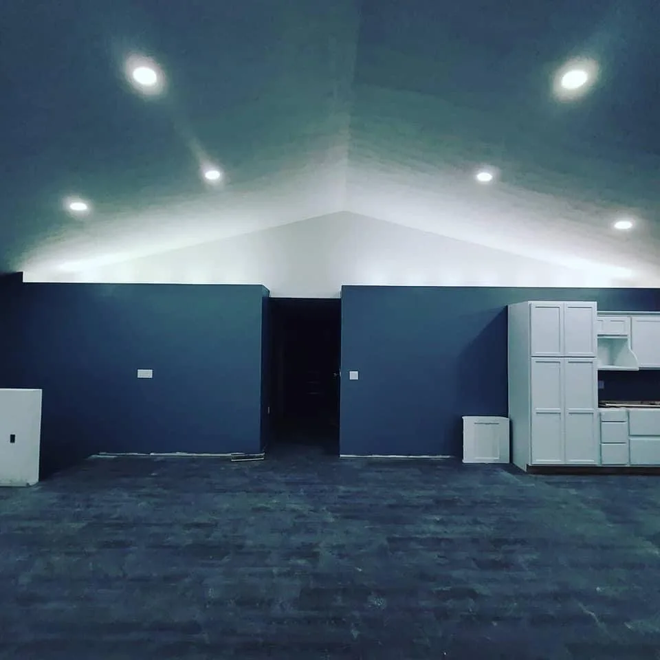
The living area of this Ohio shouse is a fantastic homage to the open concept that has become more and more popular as time goes on. We love the recessed lighting on the top of the outer walls and the way it gives just enough ambient light to give the space a healthy glow without being overbearing or draining on the eyes. If there’s one thing this Ohio shouse does well, it’s lighting and this living area really showcases that well. The designers have done a great job of making use of it and integrating it into the design of the home.
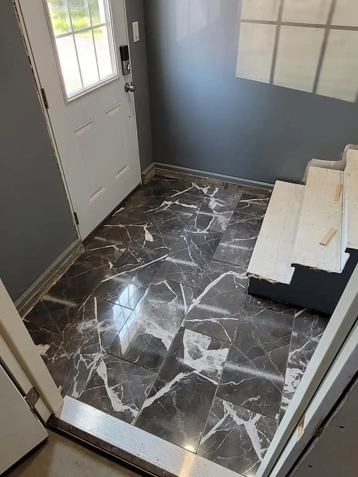
We also love the marble tile in the entryway that marks the lead up to the stairs. Having these little textural touches can work wonders in a home and this is done to a great effect here. It also splits up some of the more simple design elements that have gone into this Ohio shouse and gives it a small touch of complexity that we feel really adds something to the entire interior.
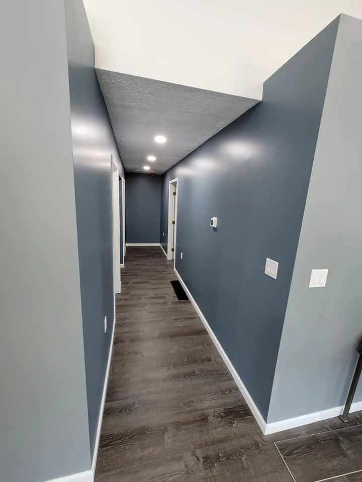
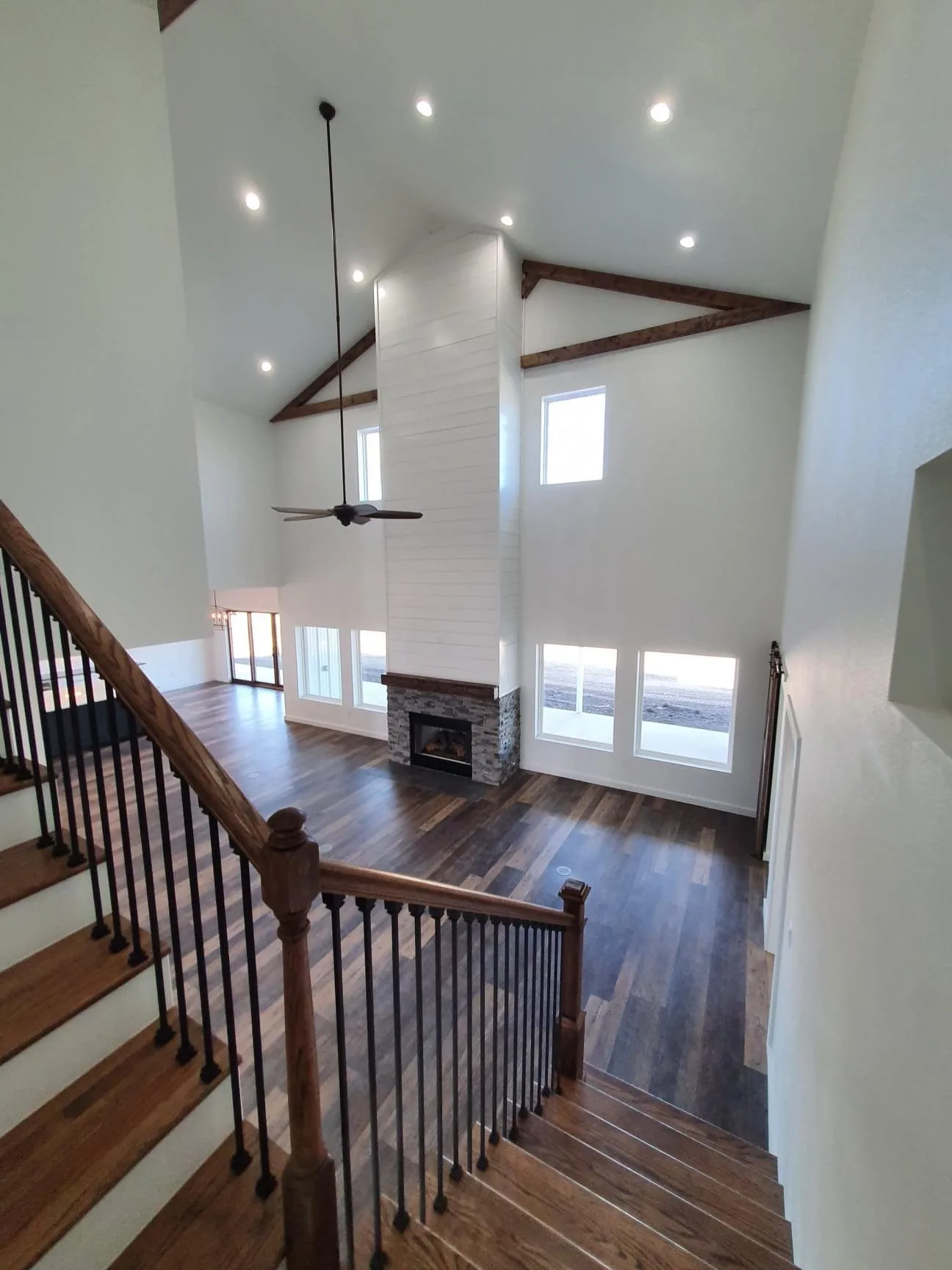
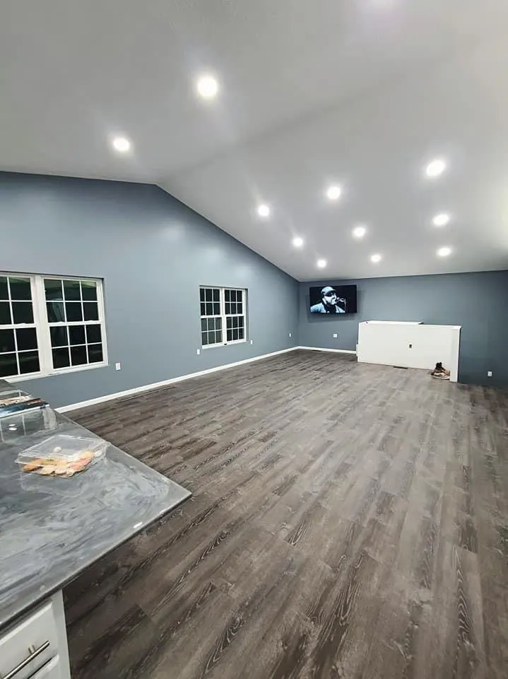
The upstairs living area is an open concept just like the downstairs, but it has a little bit brighter of a feel due to the recessed can lighting that runs along the ceiling. We love the windows that adorn the one side and can see that they bring a wonderful amount of natural light to this part of the house. By having this natural light, you can also get a good glimpse at that beautiful landscape outside. Having that connection to the outside view is a great way to make a home look bigger on the inside.
Kitchen
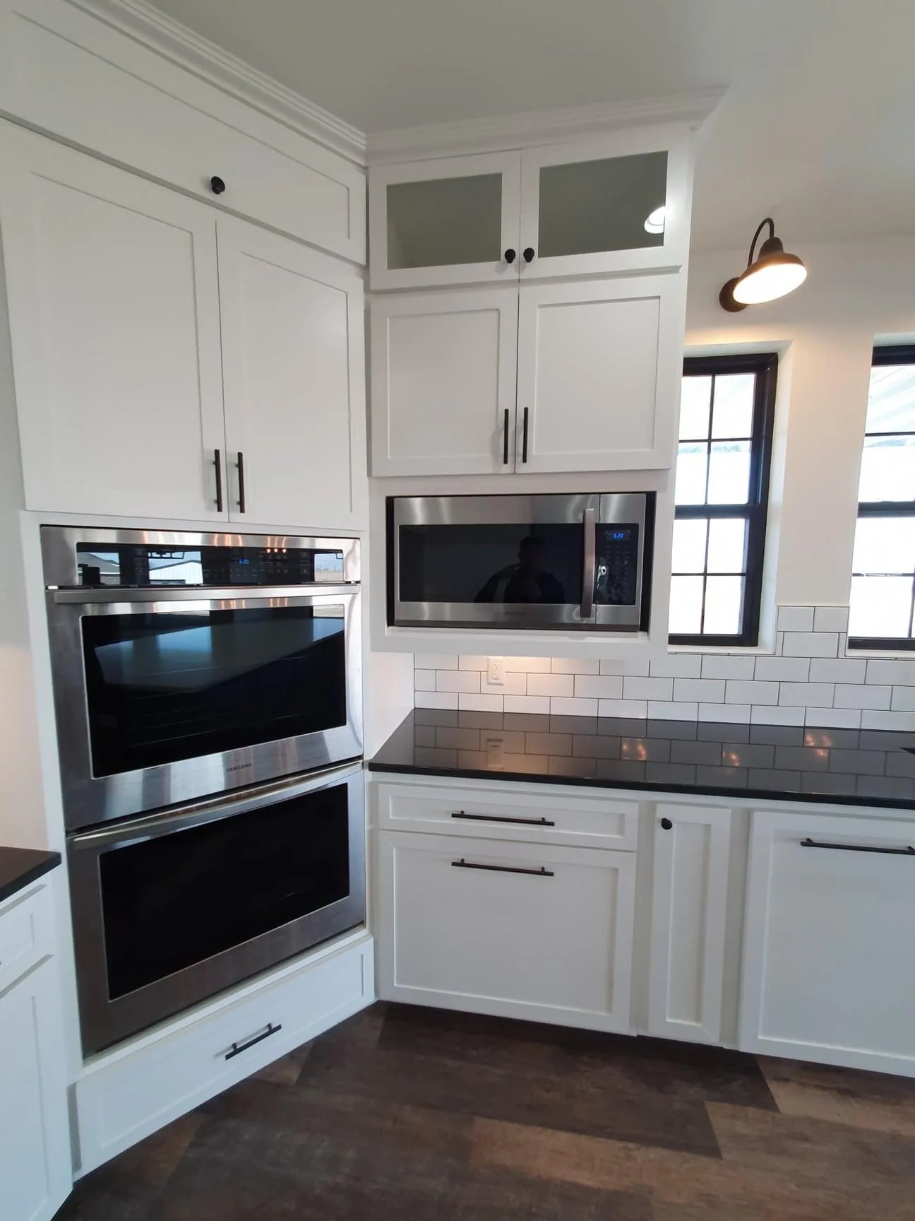
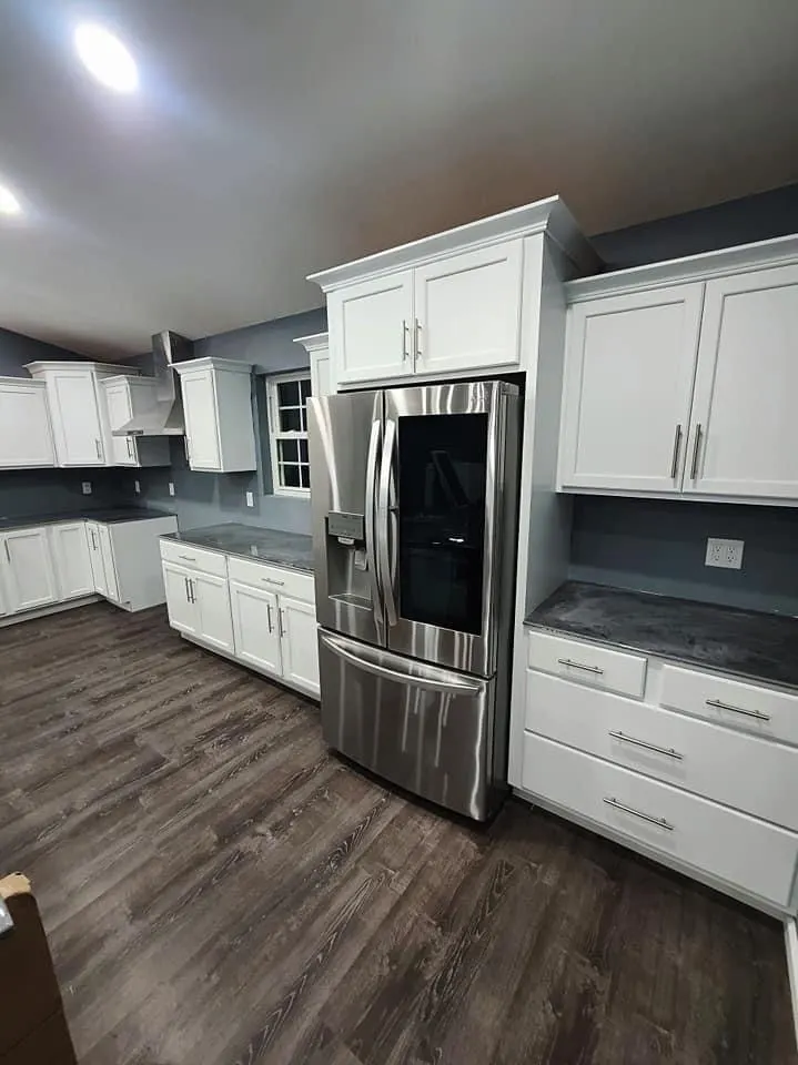
We absolutely love the kitchen in the upstairs living area and all of the design touches that have gone into making it a unique space. The gray wood floor is a unique look that we think matches perfectly with the paint on the walls and the light colors of the cabinetry. Not to mention, the stainless steel appliances that really act as a centerpiece and make this Ohio shouse come together perfectly.
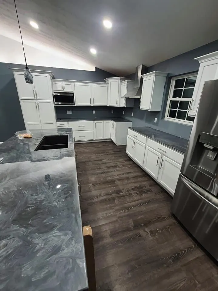
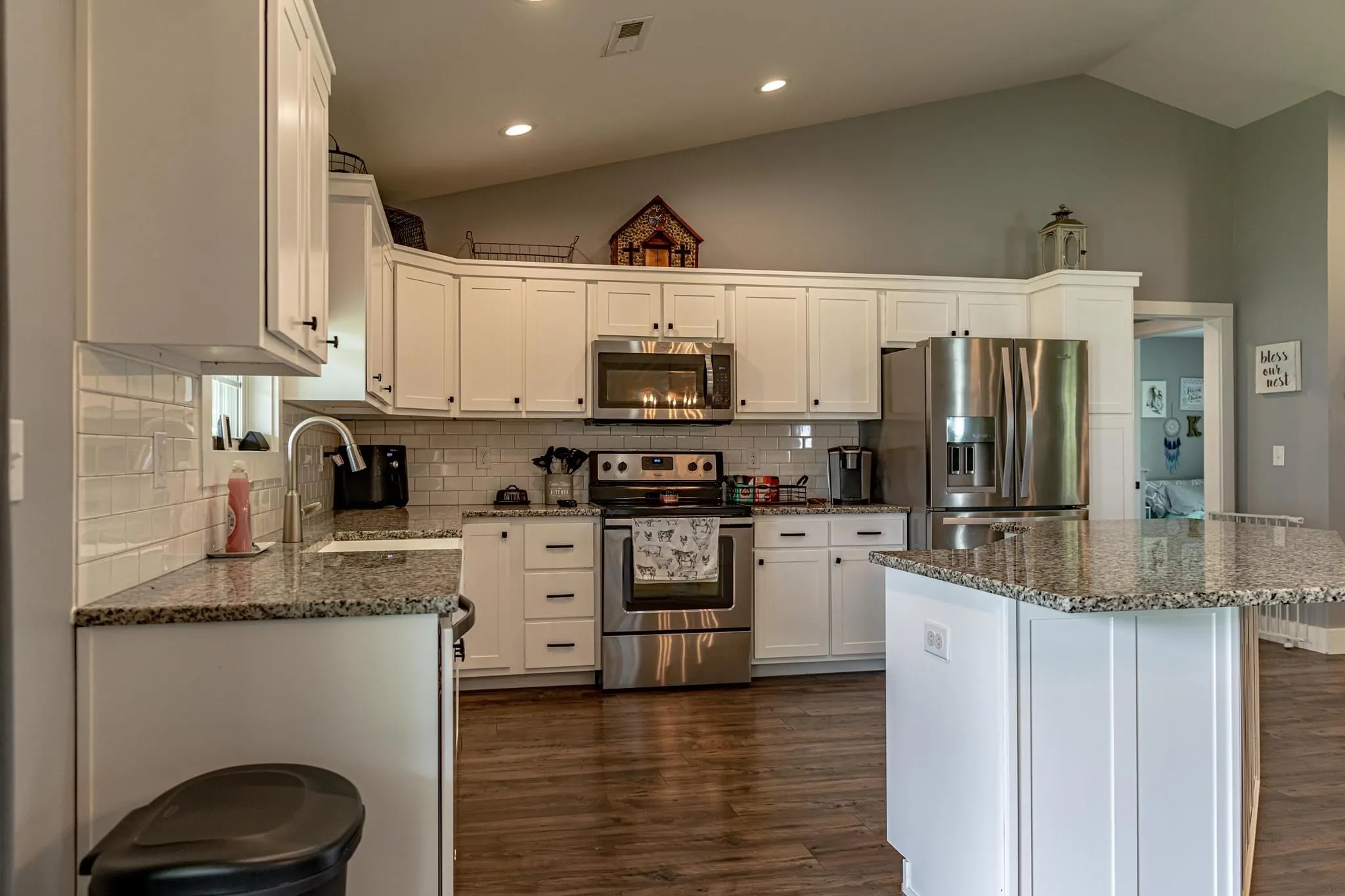
While the stainless steel is gorgeous, it is the kitchen island countertop that really steals the show in this Ohio shouse. The slate gray is a wonderful touch that adds cohesiveness and a wonderfully modern look to the whole space. We also love the minimalist light fixtures that hang over the island and give off more of that beautiful ambient lighting we have some to expect from this home.
Bathroom
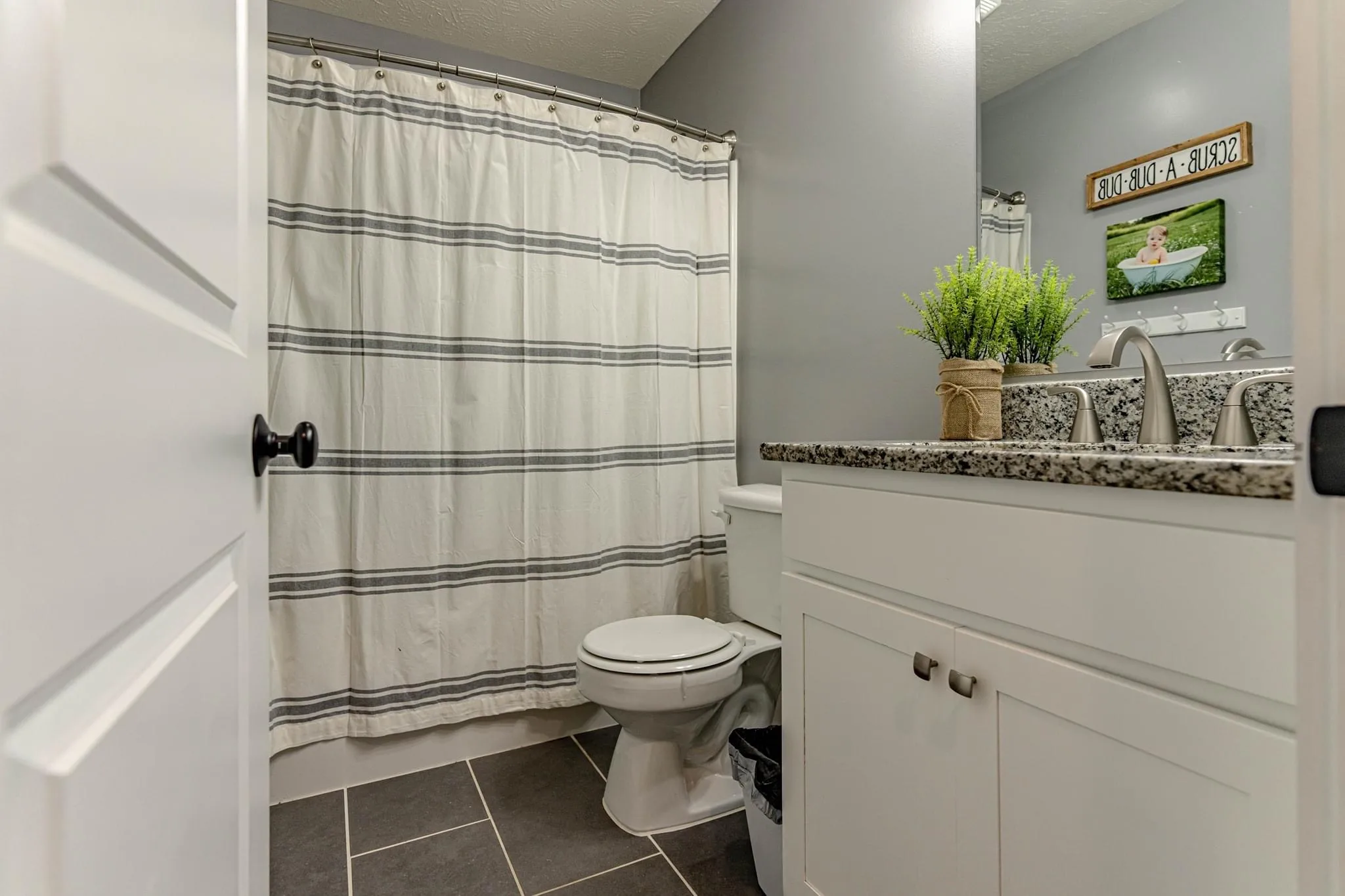
The bathroom in this Ohio shouse is another wonderfully designed little space. Even though there isn’t much room, the designers have managed to make it usable and functional with the space that they do have. We also love the colors in this bathroom and the excellent contrasts of white and darker hues that really make everything pop.
Gail currently spends her free time geeking out about what’s new and trending in the world of barndominiums.
She is the former executive editor of BarndominiumLife.com and loves working with the team and members of the barndominium community. She now contributes to the blog on occasion, but only when she feels like it!
